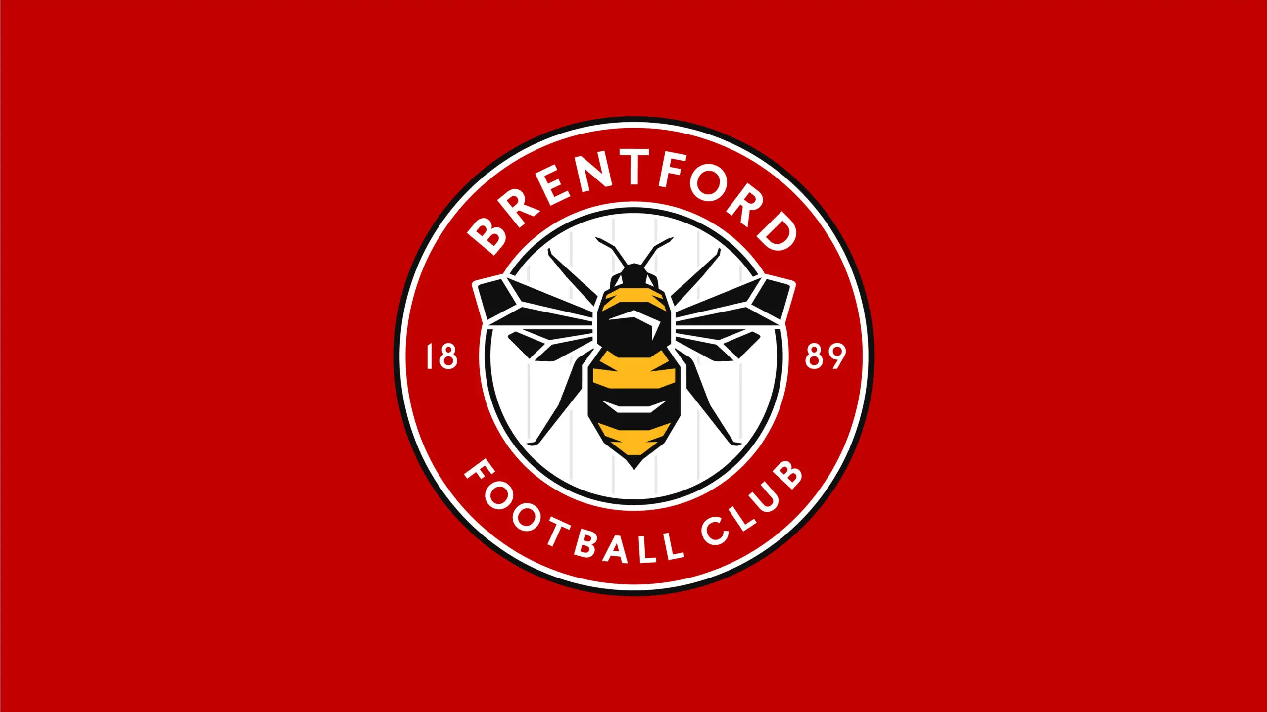
This week, Brentford made the announcement that they plan to change the club badge from next season 2017/18. The current badge has been in existence since 1993 (not including the horrendous centenary badge which has been quickly forgotten by most) and is the only badge that many Brentford fans have known.
Various reasons have been cited for the change ranging from the ‘old’ badge having lack of recognisability, being too cluttered, being not iconic enough, being designed before the digital revolution so not working as well on the various forms of media available nowadays and many more.
Football fans – being fairly traditional in their nature and normally resistant to change – have been in two minds whether a change in club badge is really necessary at this very moment in time. There is an underlying feeling with some that sometimes change is instigated for changes sake and there are times when we should leave things as they are – at least until an option comes that absolutely blows us away.
We discussed the issues around the new badge on the Beesotted Pride of West London Podcast (below) and we asked some of our podcast contributors and a load of characters to give their views. You can see their thoughts below.
Feel free to leave your comments on the new badge below.
Dave Lane
My initial reaction to the new badge is that it fails to reflect the club’s history and heritage sufficiently, and although it references a ‘similar’ badge from the late 60s and early 70s (the supporters club badge), my fear is that it will not stand the test of time.
The current badge may not be perfect, and it is difficult to read the ‘founded in 1889’ wording, but it was an evolution of two predecessors that also included the Middlesex crest – and most importantly red and white stripes – which this one does not.
The fans’ reaction to this will be interesting and I am sure will divide opinion. In my personal view it is just not special enough to change for the current one. It shouts ‘The Brentford Bees’ at me more than represents Brentford the town and the club’s history.
Marks out of 10: 6
Savvy Bee Kyriacou
I must admit my initial reaction is: that’s not bad.
Based mainly on the fact that I wasn’t a big fan of the current badge, it wouldn’t need to be amazing to elicit a positive reaction.
There seems to have been a move in recent times away from crests to something more simple. The ones I dislike the most are contorted letter combinations such as Fulham and McFranchise MK Dons. There are other very graphic badges like Bournemouth’s which gives me the hump because it’s ugly and meaningless.
The best badges for me are the simple cockerel and cannon of the north Londoners as they are clean and easily identifiable. They are less good in their slightly more modern versions and on their shields.
As for our new one. It’s simple (good), on a round shield (good) and the colours work nicely. It doesn’t feel overly modern and could easily have been a badge we had in the past.
I rather like it.
Marks out of 10: 7.5
Billy Grant
I have to admit, I’m not a big fan of the badge on our kit at the moment. To me a great badge is something that is iconic. Hard to pull off I know. But that badge is hardly iconic. On the plus side, the olde badge does reflect a number of elements that represent what the club is all about – Middlesex swords … the stripes … the name of the club and year founded …. then you have the Bees … and the hive … hmmmmm. Not overly keen on that. Just think it looks slightly amateur.
As much as I’m proud of our club being called The Bees (as opposed to them fake Barnet Bees), it’s not that easy to get a Bee to be part of an iconic look without it looking a tad childish.
So about the new badge. To be honest, its one that kind of washes over me. And there are two elements that kind of bug me. The size of the Bee (which looks a tad like a fat wasp). It’s too big. And the lack of red and white stripes as part of the badge. To me the stripes are a very strong part of Brentford fans’ identity – even more than a Bee.
Make the Bee smaller. Add some stripes. And maybe it would work better for me.
As for adding elements like the Middlesex swords? That would be hard with the current new design as there isn’t enough space. But maybe a good designer could have cleverly added these somehow. Maybe not large swords. But maybe as a small addendum up top or down the bottom (maybe add in a ‘bona fide’ ribbon like the original supporters badge had as above) – designed in such a way it did not deflect from the main imagery.
But the lack of stripes is the disappointment for me tbh.
Marks out of 10: 5
Martin The Dutchman Holland
It’s ok. It could be worse. I just don’t believe in changing badges for no reason. For me the badge in place when I started supporting is the badge i.e. 60s/early 70s crest – the one before the circle one.
The castle is the only decent one I have liked since. I am with Laney. It’s about history. The town, tradition. Not about a bee.
Marks out of 10: 6
Liberal Nick Carthew
A badge is just a badge. Players and fans should show passion whatever marketing gurus come up with in a bid to try and sell more merchandise.
It’s all about history and knowing where you came from.
Marks out of 10: 3
Matt The Allard
Not overly fussed about the badge in general to be honest. I think I quite like it if you’re going to push me for an opinion. I do like Sheffield Utd’s badge and it is quite similar.
I think you’re always up against making a Bee look cool. I know we are the Bees but it’s a very big bee.
Would have been nice to see some representation of the red and white stripes somewhere as that is more iconic to me than a bee.
Marks out of 10: 5
Jon Condorman Restall
I don’t particularly see the need to change the badge but preferred older badges to our current one anyway. The bee is very dominant, hopefully we can be equally as dominant on the pitch.
Marks out of 10: 7
Puns The Bee
Are we going to be mistaken for Sheffield united even more now? It’s OK. They could’ve really screwed it up but it is actually OK if not a little generic
Marks out of 10: 7
Jim Mortgageman
Happy with it
Marks out of 10: 8
Paddy Hughes
I like it, think it looks clean … but I also liked the current one (all though I may be in the minority there) and the castle badge too!!!
Marks out of 10: 8







It’s a vast improvement on what we had. Simplified yet bold. I much prefer the circle to the crest too. My only real issue is that last Thursday I had the bees from the current crest tattooed on my left bicep!! I’ve tweeted the club to ask if they’ll pay for my laser surgery 😉
9/10
Simple, safe, corporate, this design could’ve been honed down a little more, with a very large bee, with the requisite six legs, embroidered on the border between a red and white stripe on the left breast of the shirt, with “8”, in white , on the red stripe and “9”, in red, on a white stripe, flanking either side.
Not keen on the new badge design as it has been said other comments that the link to Middlesex is lost. But that’s just old fashion me that dosn’t like change i guess
I’ll get used to it and don’t see anything sinister in the change. Always preferred the castle and feel we should make more of our Middx links (badge or elsewhere). The current badge isn’t clearly visible on TV / in the media, unless you already know who it represents. And the hive bit is all a bit naff. I suppose it is about branding and there is a fine line to be walked here for traditional football fans. Some will say it’ll be “Brentford Bees” next, i’m more relaxed about this for now. I feared something like the FFC logo if i’m honest.
Although I’ve criticised our new direction at times, but if this is what MB wants i’m happy to go with him – so far he’s got most things right.
Looks good to me, middle legs under wings maybe,three seasons in the championship, as Rebel says MB has got most things right.COME ON YOU BEES
I really like the new badge. I know that several local references have been lost, but I think the change will be good and I like the round shape and simplicity. It could be argued that trying to get stripes into a badge over complicates it to a degree and so long as we always have striped shirts, do they need to be on the badge as well? I didn’t realise our current badge had been around since 1993, so maybe time for a change? For me its 8.5 out of 10, it will look good in the Premier League 🙂
Why couldn’t the gray lines in the white circle (behind the bee) be red? At least then there’d be some resemblance/mention of red stripes.
I really dislike the “current” badge. It’s a horror show in terms of design coherence. So this new one, though not perfect, is getting my full backing. 9/10
I like it.
I’ve always liked circular badges such as Sheffield United.
It works for me.
Hold on then, in the clubs statement on the website and other media outlets, it was well claimed that they consulted and worked with a wide range of fans to help choose this new idea, but if no one from Beesotted, none of the fans commenting on this or apparently Nick Burzon were consulted either, just who did they ask then?
I pushed the club on Twitter a few months ago to change the crest before the move to the new stadium as I thought the badge was way too fussy but my preference was to revert to more like the old castle badge I grew up with but I wasn’t asked an opinion either, so anyone going to admit they were part of the ‘consultation’ process or was this another media department faux pas and not one fan was consulted or at least given a vote on a few designs and for us to pick the most popular one???
Having said all that I way prefer it to the older one though so am relatively happy! 6/10 though for me.
Brentford is the county town of Middlesex. It has a long history, as does our club. There is no connection in the new badge. We are the Bees, yet some fans cry out we are the reds. Where are the red and white stripes in our new badge, that identify this fact, and would thus have linked the Bee to the stripes?
My criticism of the new design, is that it is pretty dull, bland and soulless. It conveys no emotion or passion; it is totally static, although the posture of the bee, is set as in-flight and is utterly undynamic, which is a shortfall re-conveying a go -for- it club image.
Interestingly, another well known BFC commentator, a person noted for partisan slanting of facts and bitchiness, when deriding opinions that don’t agree or support that pages dronings, implies, in its latest drone, the second in two days on this badge, negative opinions re-the new badge, as “wierdness”, which is quite unpleasant , but typical of that site.
That person, tries to deride questions about the six leg question, by producing a photo of a bee from the net, with four legs showing; it fails to note, that the bees wings are in the at-rest, non- flight mode. Secondly,an image of the old badge, with the bees around the hive, is produced as further proof, to mock the six leg question; “1,2,3,4, erm that’s it”; well, wrong, anyone who does not have agenda to push, will see four (4), projections from the head end e.g. twin antennae and two small legs, plus four more legs. Get your facts right, club and club apologists!
Hello, this rhetoric sounds familiar?
Horrible new badge. Just a way to boost sales at the Bees store. It’s a;so anatomically incorrect. Up the Wasps!
Sorry the new Crest is only 3/10 for me. Boring and soulless.For me the present crest is iconic, full of character and not just another generic design too similar to many other clubs. In many ways the Bees are trying to be different from rest out there. To me this new design just says here we are just another football club
I’d take the castle or a modernised version any day, but the new one will grow on most bees and the current badge needs a change. It just ain’t worth losing sleep over, if this is the worst thing in town we must be in a good place right?
Love it..simplified and clear….tweak suggestion, show 6 legs somehow….pity the 3 scimitars are no longer there but 9/10 for me
The bee on the new badge looks like a yellow-and-black Watford hornet. A number of supporters have suggested that there be red and white stripes represented in the badge. To satisfy this, and to avoid being mistaken for Harry the Hornet, I have a suggestion. How about making the yellow part of the bee red (or more reddish) to contrast with either the existing black stripes on its body, or else with red and white stripes, or else with white highlights between the red and black stripes? The colours might not imitate a real bee, but allow for some artisticl licence to represent our club colours. After all, Spurs’ cockerel looks great, but who ever saw a blue chicken?
Also, if the body were more rounded like a bumble bee it would look less like a wasp/ hornet as currently designed and which I am tempted to squash.
The bee/ hornet on the new badge looks a bit squashed and flat. Perhaps a bee in flight, from the side angle, might be better?
ABSOLUTELY HATE THE NEW BADGE, AND WHO WAS CONSULTED, NOT ME FOR SURE, BUT HELL I’M ONLY A SEASONTICKET HOLDER WHO FIRST WENT TO GRIFFIN PARK IN 1963.
We’re going to be known as the ”Fat Wasps” whoever authorised this deserves to get stung on their arse.
Probably the man who’s bankrolling us.UP THE FAT WASPS.Get a grip Fris,its a four legged bee for gods sake
I have taken a few days to let the histiria of the new design play out, because I am like most people and hate change especially when your dealing with something so close to my heart. I have being supporting the Bees from the mid 80’s, so have been in this boat before ! I must say I dont think it is as bad as some make out but on the other hand feel that some tweaking could be done, like some have said its a shame the middx scimitars are not there! and maybe the red and white stripes could have been incorporated some how. But my uncle unfortunately passed away last week and he was a passionate bees fan since the 50’s going to all the games come rain or shine, and like him I will support Brentford until my last breath no matter what the badge looks like, because he taught me at a early age its not what the design of the shirt or what the badge looks like! Its the fans on the terraces, we are a family club and always will be, so I hope we can just focus on whats important, remember we the fans are BRENTFORD FC ! and that will never ever change . Up the Bees !
The point is ,is that, to all general knowledge, there has been no consultation regarding the new badge, beyond an unknown inner coterie of club/corporate parties; for such an important club totem, there should, if there was the slightest degree of respect for the general supporter, have been a friendly outreach from the club, before this design was approved. This has not been the case. When will BFC supporters realise, the people who have control of BFC, have little regard for your feelings, or opinion on anything relating to the dear old club; they pay the dosh , they call the tune, period.
Look at a truly progressive club, such as Forest Green, what a difference to the sour silence by which which BFC supporters are treated. Any consultation with supporters at BFC, is either forced by circumstance, or non-existent.
Forest Gump are a dreadful club with a terrible old age hippy at the helm.
Always loved travelling to Griffin Pk.I personally think the new badge sucks, but then I think it could be worse and look like Fulham’s or AFcBournemouth’s, the worst badge in history!
Like most I don’t like change ! But also recognise the fact that we need to progress as a club. I have been a Bee since the mid 80’s so have seen the badge change before! My uncle who was a passionate fan started to watch the Bees in the 50’s sadly passed away last week, and he taught me at a early age things change, and it does not matter what the design of the shirt is or if the badge looks a certain way, whats important is the fans, because we represent Brentford Fc not the shirt or badge, and like my uncle god rest him ! I will support the Bees until my last breath. Up the Bees
Kind of agree with many – it loses out history. where are the Middlesex swords. 5/10 – at best.
Maybe the swords could be sown on the shirt some where ? As a compromise!
Been supporting the bees since 1964…
No one asked my opinion?
I wonder why?
Maybe because I would have pointed out the WASP right in the middle of the badge and whoever spent minutes designing the new badge obviously don’t want to hear that…Do they?
1/10
Like the badge or not john its a BEE, wasps are thinner and have five black stripes on the rear end.
On the old badge we have something much more akin to the Bumble Bee (no less a Bee by the way) – maybe we could have kept that – clearly the current design causes confusion.
The more I think about it I want my swords (scimitars) back – they originate about 1,000 years ago when the Middlesex boys had further to travel for away games.
I revise my score to 3/10. Maybe we should have an alternative badge.
I love it, a vast improvement on the current badge / crest. I think I’ll buy a shirt for the first time in ten years.
9/10.