All Kitted Out In Brentford – A Kit Nerd’s Perspective


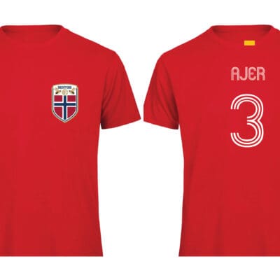 BEES Norway Ajer World Cup T-Shirt
Price range: £29.99 through £32.50
BEES Norway Ajer World Cup T-Shirt
Price range: £29.99 through £32.50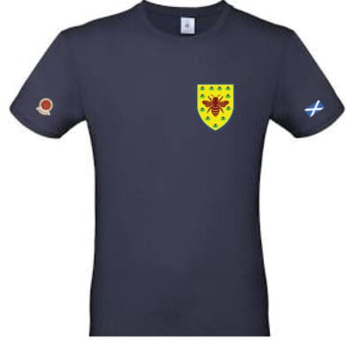 BEES Scotland World Cup T-Shirt
Price range: £29.99 through £32.50
BEES Scotland World Cup T-Shirt
Price range: £29.99 through £32.50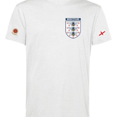 BEES England World Cup T-shirt
Price range: £29.99 through £32.50
BEES England World Cup T-shirt
Price range: £29.99 through £32.50 BEES Thiago Brazil T-Shirts
Price range: £29.99 through £32.50
BEES Thiago Brazil T-Shirts
Price range: £29.99 through £32.50 Brentford By Monorail Poster (A2) (Copy)
£24.99
Brentford By Monorail Poster (A2) (Copy)
£24.99
Well done on another super article!
I do like the new kit, and I reckon it is one of the best I have seen in my days of Bees watching (and being an older Beesgeezer, I go back to their kits from 1957)
Just two observations;
The white side panels make the players look a bit wider. Not necessarily a bad thing…
Although the numbering looks classy when close up, it is more difficult to distinguish some of the numbers from a great distance, such as the opposite side of the pitch. I anticipate a few more visits to Specsavers!
Thank you for your comments Geoff, much appreciated.
With the Kaiserslautern friendly, I’ve now seen the kit properly, not just from the front and get what you’re saying about the side panels. I do wonder if three thin black adidas stripes down the side, matching those on the shoulders, would have enhanced it. I don’t know. I do like it as it is.
Yes, the numbers are nigh on impossible to make out from distance. At least the design of the numbers change when we reach the Premier League :).
Thanks again,
Luis.