Bees fan Nemone Sariman welcomes the unveiling of Brentford’s new light blue away shirt and gives her views on what makes a good kit in her mind.
Many years ago, at some sort of local artisan craft fair, I had a colour analysis session. (Yes, this is a thing, or at least it was in the late 1990s.)
The colour analyst’s role was not only to examine my skin tone and tell me if I were a Spring (pastels), Summer (brights), Autumn (warm-toned, falling leaf colours) or Winter (cool-toned jewel colours), but also to demonstrate just how sallow, jaundiced and awful I could look in the wrong colour palette. Until then I would just wear any colour without giving it a great deal of thought but, ever since, I have been acutely aware of what suits me and what doesn’t – I’m a Winter, thank you for asking – and this includes football kits.
I haven’t been a Brentford fan for long enough to have experienced many kits through the ages, but I looked great in the ‘behind closed doors’ charcoal grey with red trim, and in the previous season’s gorgeous black and gold. I also look ok in red and white, which is just as well, and stripes suit me much better than the tone-lowering rugby club hoops as sported by They Who Shall Not Be Named.
I must confess that I winced a little at the rumours of last year’s buttercup yellow, although this was for purely selfish reasons as I knew it wouldn’t look great on me. That said, I don’t suppose this was top of the club’s priorities when choosing the colour. But, when the kit was released and I saw that the players looked fabulous in it, I was forced to eat my words; there was no hint whatsoever of mustard, egg yolk or cheese and, instead, it was fresh, tastefully cool-toned and vibrant. Most importantly, it was both visible and true-to-life on the pitch, unlike certain patterns which can blur with movement and look a mess. Portugal’s Euros kit, I’m looking in your direction.
I recall some online consternation at launch time regarding what on earth would happen when we played Norwich away, and I fear that social media users might have thought me serious when I said, “Put everyone in yellow, including the officials. Yellow for all. It’ll be fun!”
I awaited this season’s away kit with some trepidation, having heard that we might be replicating the blue zigzag pattern of Arsenal’s second kit from last season (the one they wore for the opening game of the season; some of us might need to YouTube it as we probably won’t remember what happened).
However, quelle joie when it finally dropped.
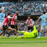
This shirt has everything: a sophisticated colour, a smart collar which I haven’t yet seen in any other club (I don’t know enough about fashion to know the name of this style of collar, but it’s exquisite), a nod to the fact that we haven’t forgotten our heritage despite hitting the heights of the Premier League, and the neatness of all logos in one, consistent colour. Oh, and the subtle marl of the fabric – at least I think it’s marl, and not pixilation on my rubbish phone – and the dark blue sleeve trim remind us that we haven’t picked up Manchester City’s kit delivery by mistake.
It may be more Spring-coloured than Winter, but I love it. And fact that I happen to look passably decent in pale blue also helps.
Here‘s what I’m adoring and abhorring in the rest of the Premier League:
- A clever take on classic stripes: This retains the club’s identity yet silences the “It looks just like last year’s kit” brigade. Bien joué, Bournemouth home and Crystal Palace home. We Bees should take note.
- Letting the club speak more loudly than the colours/patterns: Well done for having the confidence to strip it down to the bare bones, Nottingham Forest home and Liverpool home.
- Understated abstract: Nicely done, Liverpool away. This makes up for your second kit last season, which looked like a white kit that had accidentally been washed with a dirty brown sock.
- Tepid pink: Oh dear, Everton away. Losing Richarlison and now this. Hopefully staying up offers some consolation.
- Peter Pan collars: If you don’t know what they are, you soon will because they’re everywhere. Why, Arsenal home? Why, Manchester United home? Why, Leicester home? They can’t be comfortable, and they make the players look like little boys.
- Designs that aren’t stripes yet also aren’t NOT stripes: Make up your minds, Southampton home and Brighton home.
- Kit that looks too much like another club’s kit: Or does Kevin de Bruyne now play for Bournemouth (Man City away)? Even City’s home kit, minus the logos, could belong to Aston Villa or West Ham; Phil Foden’s facial expression and Jack Grealish’s body language in the promotional photos scream, “Pleeease can we take this off now?”
A stunning kit certainly isn’t a guarantee of success. But it has to be better for morale than a duff one, yes? Let’s hope that our beautiful blue brings us luck this season. Come on, you Bees!
No discussion about kits can be complete without a mention of that Jaffa Cake brown away kit. Let us remember it now, with bowed heads and in a “Those who cannot learn from history are doomed to repeat it” kind of way. And then let us never speak of it again.
Nemone Sariman


