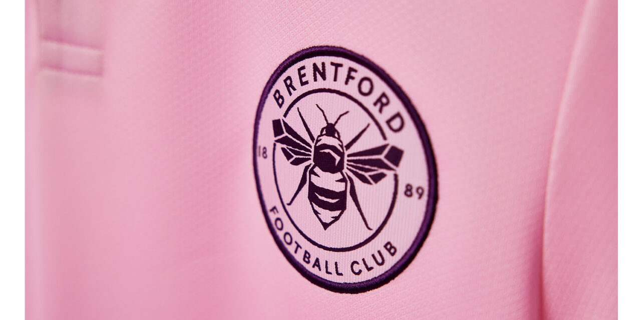
Not Just A Colour, But An Attitude! The New Pink Kit


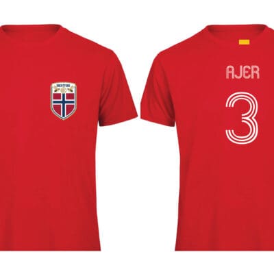 BEES Norway Ajer World Cup T-Shirt
Price range: £29.99 through £32.50
BEES Norway Ajer World Cup T-Shirt
Price range: £29.99 through £32.50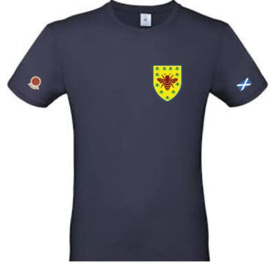 BEES Scotland World Cup T-Shirt
Price range: £29.99 through £32.50
BEES Scotland World Cup T-Shirt
Price range: £29.99 through £32.50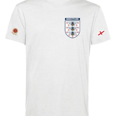 BEES England World Cup T-shirt
Price range: £29.99 through £32.50
BEES England World Cup T-shirt
Price range: £29.99 through £32.50 BEES Thiago Brazil T-Shirts
Price range: £29.99 through £32.50
BEES Thiago Brazil T-Shirts
Price range: £29.99 through £32.50 Brentford By Monorail Poster (A2) (Copy)
£24.99
Brentford By Monorail Poster (A2) (Copy)
£24.99